Making Tonal Adjustments Using Curves in Adobe Photoshop

Curves are one of the most powerful image editing tools, but also one of the most intimidating, as it can appear to be rather complex at first glance. Without getting into long technical explanations about how the Curves tool works (I might do it in a separate post), in this post I am going to share with you a few quick tips designed to help eliminate the fear of using curves and help you start using them to make simple, but impactful tonal adjustments to your images.
The tips I am going to be sharing in this post can be applied when editing all sorts of images: it is not just about editing photos, as curves can be effectively used to enhance the look of photographs, graphics, artworks and illustrations alike!
Curves work pretty much the same way across all apps which have a Curves adjustment tool, so whether you are using Adobe Photoshop, Lightroom or something else, the logic behind making curve adjustments will be the same. But since I’ve labelled this as an Adobe Photoshop technique, let’s start with an important note specially for Adobe Photoshop users.
Show Amount of Light Curves Display Option in Adobe Photoshop
Since in Adobe Photoshop you can work with a range of different colour modes, in the Curves adjustment dialog you have two Curves Display Options to choose from (these can be found under Curves Display Options via the menu in the top right corner in Properties panel for the Curves adjustment layer or in the main Curves dialog for the smart or regular Curves adjustment): Show Amount of Light and Show Amount of Pigment/Ink. Regardless of the colour mode of your image, select Show Amount of Light option: this way you will have the black point in the bottom left corner and the white point in the top right. Using this display option, which is the default option for RGB images, will give you the same Curves view as in Adobe Lightroom apps.

If you are working in Adobe Photoshop, apart from setting the Curves Display Option, I’d highly recommend that you work with the Curves adjustments non-destructively: don’t hesitate to check out my post Making Non-Destructive Image Adjustments in Adobe Photoshop in which I outline two techniques for applying adjustments non-destructively in Adobe Photoshop.
In this post I will be sharing tips for making tonal adjustments using curves and not making colour adjustments, so everything described below applies to the main tone curve (labelled as RGB, CMYK or Gray curve in Adobe Photoshop or Point Curve in the Tone Curve section in Adobe Lightroom, Lightroom Classic or Camera Raw).

Bringing in Pure Blacks & Whites
If your image is lacking black and/or white colours and hence lacking in intensity and contrast, you can easily fix it by simply moving the black and white points inwards along the horizontal axis to the areas where the information starts on the histogram.
When you move either of these points horizontally, you will notice the slider indicators below move as well: you can move these indicators instead of the actual points on the curve if you want to shift the black and white points along the horizontal axis, whilst preserving their positions along the vertical axis.
If you move the black and white points further in, all of the tones in the image to the left of the black point will become pure black and all of the tones to the right of the white point will become pure white. This can be useful if you are working with some scanned graphics or illustrations where you need to flatten the background and have solid black areas of ink in the artwork. On the other hand, squashing tones in photographs will lead to losing information in the dark and light tonal areas (called clipping), which is not ideal.
Lightening Tonal Regions
To lighten a specific tonal region in your image, add at least one new point to the curve and then move it above the diagonal line going across the histogram. If you have just 3 points — black, white and your custom point between them — lifting the latter will gradually lighten the whole image. If you want to preserve some other tones, you will need to add additional points to the curve and keep them as close as possible to the diagonal line to keep these tones unchanged.

Darkening Tonal Regions
Darkening tonal regions is a direct opposite process of lightening described above and is achieved by moving the points below the diagonal line.

Increasing Contrast
To increase the contrast in your image you simply need to make the lighter tonal regions even lighter and the darker tonal regions darker. So you will need to have at least 4 points on the curve and move the one in the lights or in midtones above the diagonal (or above their original positions on the curve), and move the one in the darks or shadows below the diagonal (or generally lower than their original position), which will create the famous S-curve.

The beauty of the curves is that you can control precisely which tones you are making lighter, which tones you are making darker and which tones you are keeping the same (by keeping the points on the diagonal line), so add as many points to the curve as you need (the maximum number of custom points you can add in Photoshop is 14, which is more than enough) and move them around to achieve the desired effect.
Note: when using multiple points on the curve, make sure that the curve is smooth and gradually rises from the bottom left to the top right.
Reducing Local Contrast in Specific Tonal Regions
Decreasing contrast is probably not something you’d need to do often to the whole image, but if you need to do this within a specific tonal region, you will need to move a pair of adjacent points closer together along the vertical axis making the line between them less steep. When doing so avoid moving the point to the right below the point on the left as this will result in inverting the tones, which in most cases is not desired.
Using multiple points and slightly reducing contrast in the highlights and in the shadows, can help you achieve a softer look in the select tonal regions, and can be a part of creating a complex fading effect.
Creating a Faded Look
Creating a faded look is one of the most common creative uses of the curves in photography and implies eliminating pure blacks and pure whites from the image, which allows you to make any digital photograph look more film-like and have more character.
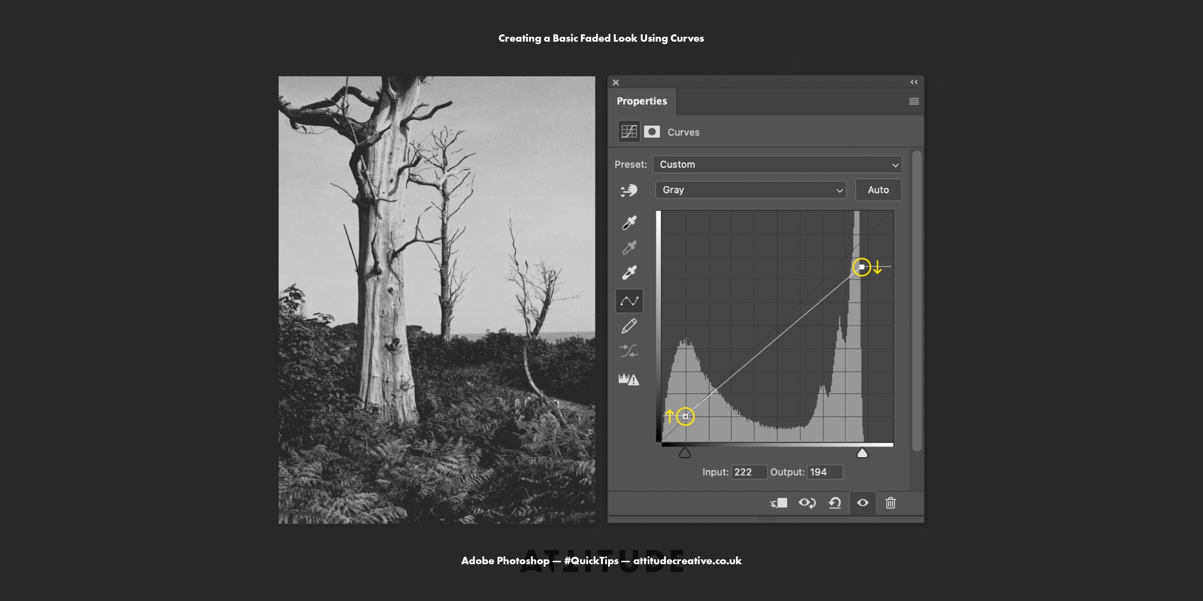
To achieve the most basic faded look you will need to lift the black point and lower the white point. In most cases, to create a more exciting edit, you will want to combine moving these points with additional curve changes, for example increasing the contrast throughout the whole image.
To achieve a more pronounced fading effect and have soft squashed highlights and shadows, add additional points to the curve in the shadows and highlights regions and move them along the vertical axis to be closer on the vertical level to the black and white points respectively.
Using Curve Presets
If you are feeling lazy or still a little intimidated by working with the curves, you can explore the standard Curves presets included in Adobe Photoshop. In the list, you will find a range of the presets which will allow you to lighten, darken and increase the contrast in the image in a few different ways, but none of the presets will affect the black and white points, so you’ll need to move these manually if you want to either achieve pure blacks and whites or fade blacks and whites instead. And in any case, you can always build upon the curves presets to tweak the adjustment to your liking, and of course, you can save your own presets based on the adjustments you often make to your images.
I hope you have picked up a few new tips for using Curves to make tonal adjustments to your photographs or other kinds of images! Don’t hesitate to check out my blog post about applying non-destructive adjustments in Adobe Photoshop to be able to get the most out of the Curves and other kinds of adjustments. And if you are into photography and use Adobe Lightroom Classic or Adobe Camera Raw, don’t hesitate to check out our popular course Adobe Lightroom Classic: Advanced Workflow & Tips for Enhancing Your Colour Edits (available on Skillshare and on Teachable) to learn how to enhance your photo edits using a range of colour editing tools in Adobe Lightroom Classic, including more Lightroom-specific tips for using curves.